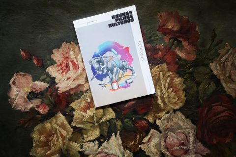
The great news of 2023, which warmed the hearts of architects, historians of this field, interwar period fans, and the general public, was that the modernist architecture of Kaunas has finally been included in the UNESCO World Heritage List.
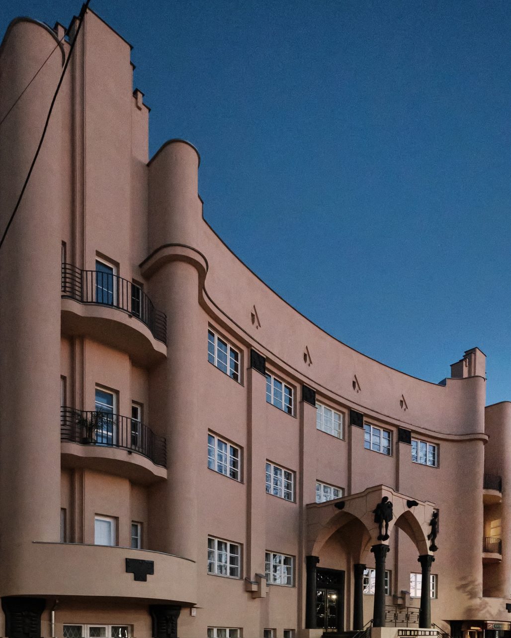
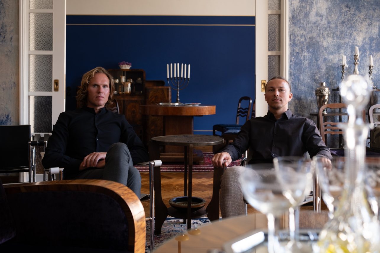
When, some six years ago, we met businessmen Karolis Banys and Petras Gaidamavičius in an empty flat on Gedimino St. 48, their eyes were already burning with that flame that today unites hundreds of modernists or optimists. Art Deco Museum was opened in that same flat in May 2020. The Kaunas residents bought their second apartment nearby, in a building with rather expressive shapes located on Vytauto Avenue 58, where they planned to reside. However, the flame is too strong to keep it only for your own soul’s warmth. So, this January, the Amsterdam School Museum also invited the first visitors (to visit the apartments you must register for a guided tour).
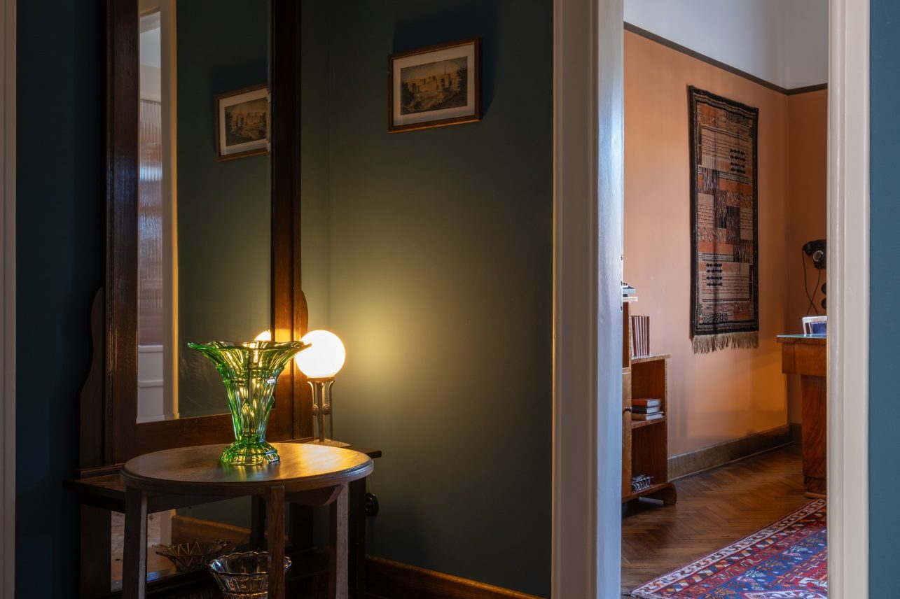
The apartment on Gedimino Street presents the life and household of upper-middle-class interwar period Kaunas residents, but the only example of Dutch modernism in Kaunas, apartment no. 6, hides somewhat different, more personal, and private stories. Big dreams, successful businesses, ambitions and status, and the whole world at your feet… When you step into this apartment’s living room, you don’t feel like you are in the present or even in Lithuania. Then, walking around the rooms, looking at the curves of the furniture, observing the shadow play created by indoor plants and interior details, you become completely absorbed again and again. Although such solutions are not for everyone, they inspire fascinate, and invite one to take a deeper interest and ask more and more questions.
It is not known who created the original interior of the apartment, but many details suggest that it was the owner of the flat, Henoch Pumpianski, who worked in transportation and loved bright colours, who dictated the style. It is known for a fact that the house itself was designed by Jokūbas Peras, an architect who lived nearby. According to the documents, all apartments were rented. Unlike his ever-changing neighbors, Pumpianski lived here all the time. By the way, Karolis and Petras visited some of the neighbors and found out that the walls of their apartments were less extravagant: greenish or brownish. Most of the old residents of the house were killed during the Holocaust and no one has found photographs of the apartments yet. Maybe they were taken away or destroyed, or perhaps they are waiting to be discovered in some archive. Malka Horwitz, the niece of Mozė Posvianskis – one of the owners of the house, who lived in the apartment below, no. 4 – used to visit this apartment before she emigrated to Jerusalem with her parents during the interwar period. She said that she would go to Palanga with her uncle, thus the painting depicting the landscape of Palanga can be found hanging on the Amsterdam School Museum’s living room wall.
Karolis and Petras managed to get to the bottom of Henoch’s story when they were looking into the fates of the owners of their latest purchase – a manor house located in a village near Gelgaudiškis. They decided to look for the names of other persons related to their museums in one of the archives. They discovered that in 1933, a Lithuanian citizen by the name of H. Pumpianski got on a cruise ship in the south of France that sailed to Athens, Istanbul, and Haifa, visited Egypt, and then went to New York where Pumpianski spent a couple of months. Such trips must have definitely influenced his taste and a sense of aesthetics.
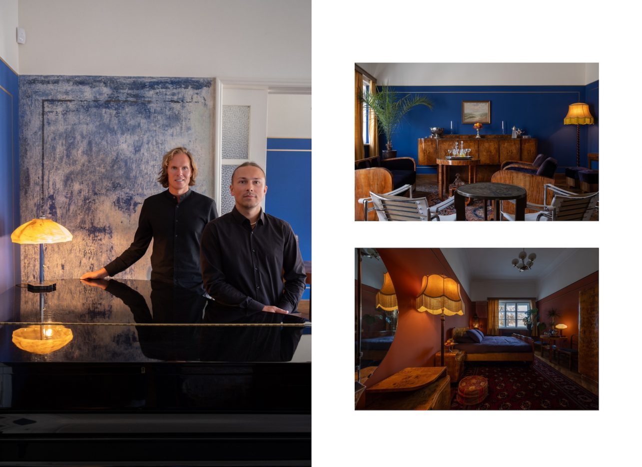
“This is luxury,” Petras refers to the colour of the living room walls. Karolis adds that there are various names for it: royal blue, navy blue, ultramarine. It is Lapis lazuli blue. Lapis lazuli is a special form of lapis stone, an extremely expensive pigment. These stones are mined in Afghanistan, now also in South America. Of course, such a choice implies a display of status and confidence. Petras explains that some visitors, having learned that the Jews of Kaunas are important to the history of the house, name the colour precisely in that way. But the actual heavenly blue – tekhelet – can be seen in Kaunas Choral Synagogue.
When asked how many layers were covering the Lapis lazuli blue, Karolis clarified that the very first layer, applied during the furnishing of the apartment, was simply blue, and the brightness was uncovered during the renovation. Maybe it happened when the owner got rich?
When Karolis and Petras bought the apartment, it was in a tragic state. Its last owner inherited part of the apartment from his parents and then bought the remaining rooms. To put it mildly, he did not love this apartment and perhaps his life too. Of course, it suited the director of the Chernobyl series. The production team had somewhat cleaned up the apartment that became the home of Legasov in the series, so you will not see the real image on TV. But you will see it in the photographs if you come on the tour. I can only spoil one detail: the living room walls were of a greenish colour with brown stains as such decoration was popular at some point.
Interestingly, the colours and walls in this interior are not protected legally. “Bearing in mind that we have found national motifs under the paint in the first apartment, we carefully scratched the wall in this one by ourselves,” Karolis says. Wallpaper, paint, again wallpaper, and yet again paint… After all, according to experts, people redo their walls around every ten years. Petras admits that back then, in 2017, when he saw the ultramarine, his brain generated an error, “Who could live in an ink-coloured interior?” Googling the ‘dark blue interiors’ opened up a whole new world of luxury and taste. “We didn’t grow up in such interiors, so it was new to us,” Karolis said. Later, Verutė Trečiokienė conducted a polychrome study here and determined the height of the painted area also discovering the golden bronze stripes. They were restored, although the owners were afraid that they would look cheap and tasteless. Unfortunately, this is how gold in interiors is viewed today. “However, we decided to be brave and restore everything to the way it was. And really, it couldn’t be better.”
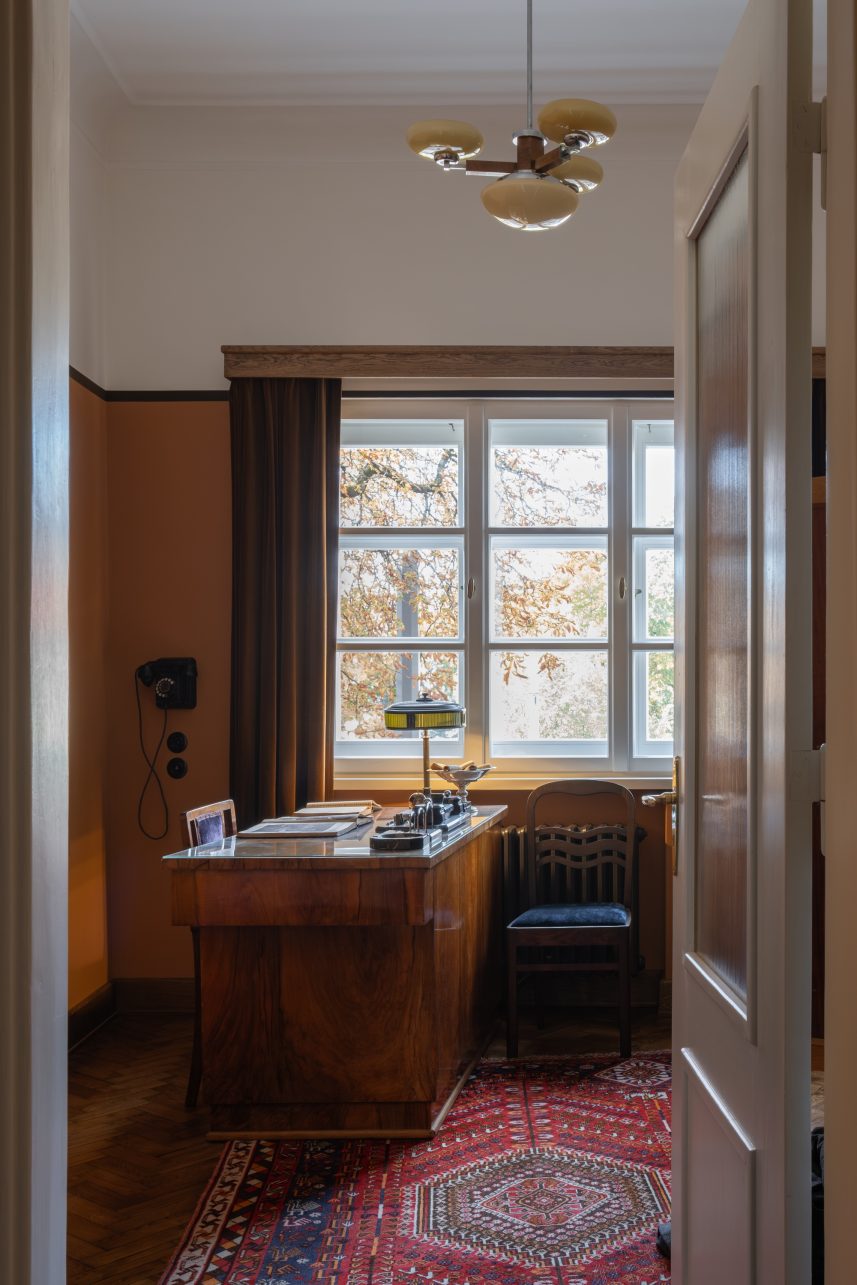
The colour of the kitchen also changed from blue to orange in the interwar period. The first blue resembles water. It is the same in the bathroom and in the Art Deco Museum. However, the kitchen tiles contained brown rather than blue stripes, and these colours did not match. “We realized that during the interwar period, the standard of that time was chosen, unfortunately, it did not fit, so the situation was corrected with a layer of brownish-orange paint. Besides, the architectural style of the Amsterdam school is orange, brown, and black,” Karolis explains. Orange is a stimulating colour. The office walls are also painted orange. Then as well as now. It seems like a logical choice – rooms where you do something creative, be it related to pots and pans or papers.
There are two bedrooms in the apartment: one for the owner and one for guests. Let’s start with the latter. “We didn’t intend to open a museum here, we thought we would restore the interior and live there. Blue, orange… seemed fun and beautiful. It turned out that the walls were red in the guest room. Wow, how could people live in red rooms?” Petras remembered and Karolis added that he seriously considered not to recreate the wall colour in this room. “Perhaps we had just seen too many tasteless ways of using it in the interior.” But when the silicate paint was mixed, and everything was painted and the dark stripes with a golden line added all worries vanished. Moderate, unusual, youthful, and modern! “Living in such an apartment, when you walk from the blue living room to the orange kitchen and the red bedroom, it is impossible to get the blues during the long gray winter.” That’s the advice, if not for this, then for the next cold season.
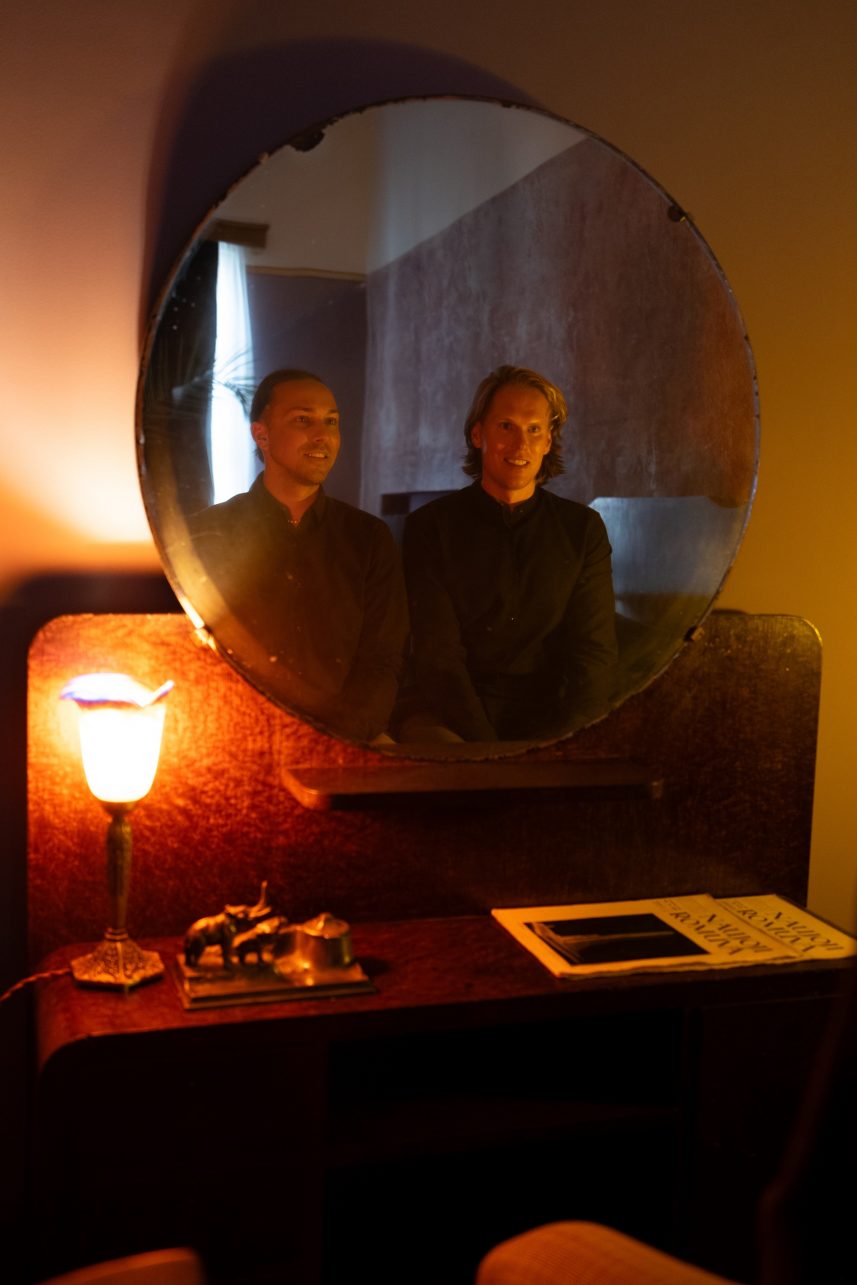
And what is special about silicate paint? After uncovering the original layers of paint, the owners were impressed by the depth of colour that resembled a fabric. Obviously, you cannot achieve this effect with lime paint. Chemical tests ordered at the Pranas Gudynas Restoration Center revealed that these are silicate paints made from natural ground silicate stones. The walls breathe through the pores in the stone, and it is the pores that create the effect of depth. They are matte and sharp – if you run your finger over them, they will be visible. So, in this apartment, you can do everything, sit on the sofas, open the cabinets, and touch the really magical-looking Persian carpets bought at auctions, but you can’t touch the walls. “We have acquired some habits. For example, we started noticing that during tours people keep bending over in one place, so we added a flower table there. And in another spot, we hung a rug on the wall,” Petras says.
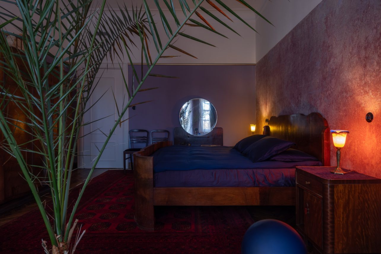
The loudest “Ooooo” is heard when guests enter Henoch’s bedroom. Well, after visiting the ultramarine living room, you can’t expect anything better, but the owner’s private space does enchant you, first, with its size and then with its colour. During the research, it turned out that the first option was dark lilac, almost burgundy – in harmony with the rest of the rooms. The second layer is light lilac, with which a four-centimeter-wide gold stripe appeared, framed by ultramarine blue stripes. Perhaps the owner wanted more light in the bedroom but did not want to give up the idea.
I’m still very curious about where the three Amsterdam school colours come from. The guys say that orange bricks were popular in the Netherlands along with the tinted brown oak and black decors. “On the front facade of the house, you will see decorative balcony corbels, which are black just like the sculptures,” Petras points out. The sculptures depicting Mercury, the Roman god of trade, and Hephaestus, the Greek god of craftsmen, unlike most of the sculptures of that time in Kaunas, are slender and graceful. The colour of the facade of the house, recently restored with the support of the Kaunas heritage protection program, is close to ochre, orange/brown. It doesn’t stain, is not demanding, and does not stand out much in the overall colour palette.
We can also view the colours in this apartment as well as in the building through a queer lens. The term queer, which has no equivalent in Lithuanian, is a contradiction to the norms prevailing in the relationships of both heterosexual and homosexual people, a dissatisfaction with the existing structure. “We can talk about a unique expression and the concept of eroticism. In this sense, the building on Vytauto Ave. 58 as well as this flat, are quite homoerotic. There are many colours, joy, and gaiety. As for the sculptures, Hephaestus here is slim, not the way that he’s usually depicted. There are also bas-reliefs of half-naked men above,” Karolis looks up. In addition, the style of the house leads to the Netherlands, and Amsterdam has a long history of tolerance and is the first city in Europe to decriminalize homosexuality. And, well, Henoch’s wife did not live in Kaunas, but in Gdansk.
Did exposure to such stories somehow change the daily life of Petras and Karolis? “Yes. It is pure pleasure and no more fear when we see colours in the interior. We have just finished furnishing a couple of newly built apartments for rent. In them, we pay respect to these discoveries of ours. Our experiences came through when choosing the colour for the walls, parquet, tiles, and furniture,” my interviewees add to each other’s statements and assure me that such colours allow us to escape the routine.
“The builders of this house, Mozė Posvianskis, and Hiršas Klisas, came from poor families, the fourth generation Vilijampolė residents. The building was finished when they were 27 and 28 years old. They were young people, who appeared at the right time and in the right place, worked hard, were not afraid to take risks, took many loans and that motivates us,” Petras said. So, this house seems to declare that it doesn’t matter who you are, and what colour are your eyes. If you want something, you must take a risk and do your best,” Karolis continued. According to him, the story of the first owners of the house really inspired them to take a risk and buy the aforementioned manor. I wonder what colours the experience of reigning on the banks of the Nemunas will bring.