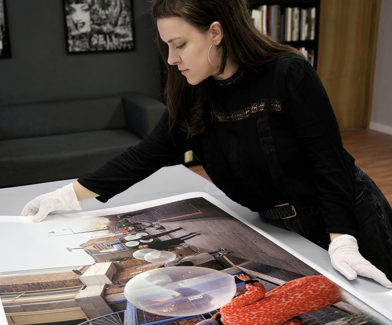
If you need to add some colour to the black and gray November, go to Vytauto Avenue because the photography and printing studio aust.studio opened its doors there back in February. The range of services it provides is wide. In addition to printing out photographs or illustrations, you can also have them retouched, choose printing methods, scan, reproduce images, separate colours, engage in digital archiving, and even read books about photography on a well-stocked shelf. The studio provides services outside Lithuania, too. It also contributes to the preparation of illustrations for exhibitions, events, photo albums, and other publications.
The studio was founded by Ieva Austinskaitė, Damian Chrobak, and Raimundas Austinskas. Ieva and Damian are professional photographers who have been working in this field for over a decade. Having lived in London for a long time, where they accumulated a lot of experience, they decided to open a studio in Ieva’s hometown. In Kaunas, the couple was joined by the co-founder of the studio, Ieva’s father Raimundas Austinskas, a craftsman with extensive experience in the field of printing. Ieva said that printing in her family goes back 4 generations, so it was clear – these people really know how to magically turn a white sheet of paper into a colourful story.
You opened the doors of the studio in Vytauto Avenue in February this year. How and where did aust.studio operate until then?
We have been settling in and getting organized little by little since last November. It’s nice that the common dream is materializing, and gradually expanding; more and more people are interested in our activities. We also have more ideas about how to settle in and work here. Before the opening of the studio, we also worked in the field of photography, we collaborated with other creators, galleries, museums, publishing houses, and printing houses. The emergence of the studio made it possible to combine separate skills and techniques, work together, and create a common medium for photography – and not only – professionals and enthusiasts. My father, Raimundas Austinskas, has been working in photography preparation, offset, and scanning for over forty years, and Damian and I lived in London for a long time, so a large part of our experience comes from studying and working in this city. It’s been a journey of nearly ten years of exploration for me, and eighteen for Damian.
Why did you choose Kaunas?
We visited Kaunas often, I was born and grew up here, and Damian would also be left with pleasant memories whenever we visited. London is full of photography centres, laboratories, and press studios, while I could feel a lack and a need for them in Kaunas. At the height of the pandemic, everything somehow came together very quickly and moved forward, so we made the decision to move and implement our idea.
You are both professional photographers. How did you get into printing and publishing? What prompted you to merge these two fields?
For us, photography is very much related to printing. You want to see images not only on screens but also in a physical, tangible form, to create a deeper connection with captured images, and to pay attention to every detail of the print: paper selection, photo preparation and retouching, and rendering. My family has been involved in printing since my great-grandmother. Maybe that’s why I find this craft so interesting and close to my heart. Damian’s very first steps in printmaking were probably in the photo lab at the Warsaw Academy of Photography and the London College of Communication, while mine were at the Middlesex University and the Royal College of Art. While living in London, we worked at several laboratories – photography, art print – and framing studios The Printspace and A Bliss. Practical experience gained in these companies was more than work, we learned retouching, archival printing techniques, preparing photos for exhibitions, scanning, and framing. We are working with Magnum Photos agency’s photo press projects to this day. When collaborating in publishing, we basically apply the same knowledge and techniques, only to the publication format. Personal experiments, experiences, mistakes, and a feel for printing techniques only strengthen the desire to share this process with others and get involved yourself.
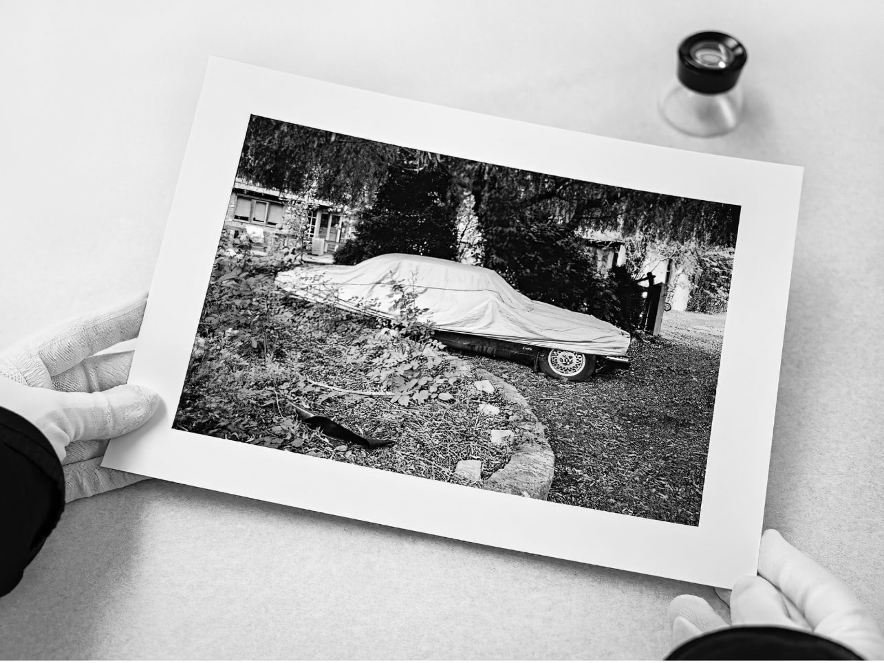
In addition to all printing, archiving, editing, and scanning services, you offer a high-quality giclée printing service. How is it different from the standard one?
Actually, there are many printing techniques, and one can get lost in all the nuances and differences. The term itself comes from the French language and means ‘to spray’. CMYK printing method consists of four colours, while in giclée printing we use twelve different colours of archival ink. With such a wide range of colours and spraying the paint in very fine dots, giclée printing can produce extremely high-quality, rich, and tonally deep prints. This technique is long-lasting, prints kept in the right conditions do not fade and retain their quality.
When can this technique be used?
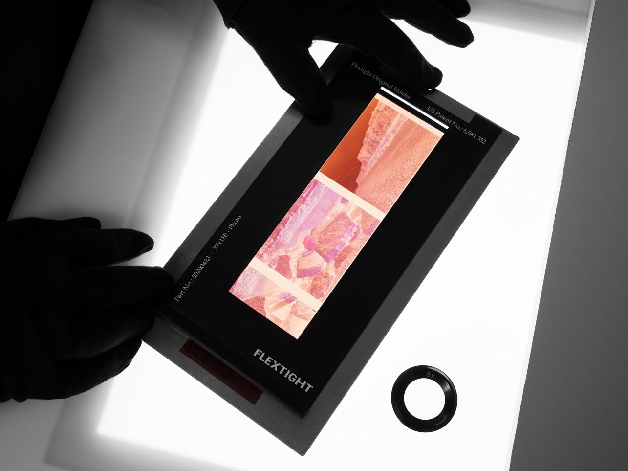
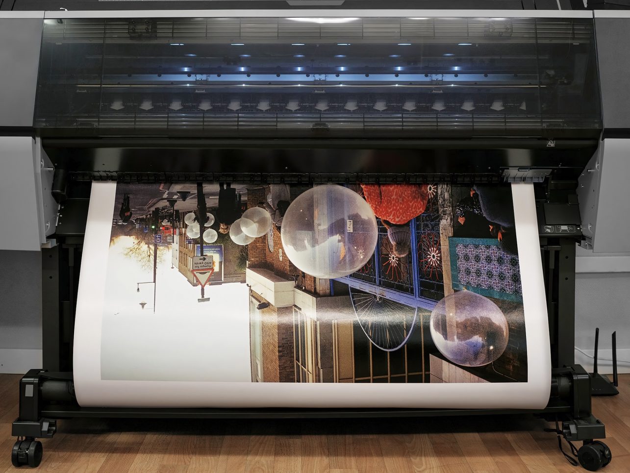
Due to its colour gamut that covers almost 100% of Pantone colours, this technique is suitable for printing photographs and artworks, graphic images, illustrations, and other image reproductions. All prints are made using the latest technology printing equipment, inks, and archival paper: glossy, matte, or textured. In addition to giclée printing, we use a virtual drum scanner for film material, and a flatbed for illustrations and documents because we work with archives and their digitization. All these tools help to work with analogue and digital material for both professionals and people who want to get familiar with this process.
In addition to working with archives, you have contributed to the preparation of illustrations and archival photos for various publications. For this, you use the colour separation technique. Tell us more about it.
We apply colour separation when preparing images for publications, photo albums, magazines, catalogues, and other offset printed publications. We cooperate with publishing houses, artists, designers, and printing houses in Lithuania and abroad. The colour separation itself works with colour analysis, brightness, image preparation for press, and retouching.
In the process of colour separation, we apply corrections according to the selected paper type, since each type affects the image in its own way and what we see on the screen has a completely different materiality on the paper. According to the separated channels of the four colours, the forms used in the final printing are produced in the printing house. Each publication project is different, the material itself dictates what kind of preparation will be required. Sometimes we work with archives, their restoration, and retouching, sometimes with artwork reproductions, and editing of monographs and art publications.
You are both photographers. How do you usually decide which shot is best, monochrome or colour? What different emotions or messages can colour, and black-and-white photography convey?
The chosen photographic medium can direct the viewer’s attention to certain details in the captured image, sometimes even helping to form a narrative between individual images. This is especially relevant when working in series. Colour carries a lot of information, temporality, and emotion and can act as a connecting element or detail that draws attention, helps to communicate an idea, or a story, or simply captures moments. Colours seem to add an additional layer of information and feeling.
When choosing black-and-white photography, much more attention is paid to the detail in the image, the contrasts, light, and shadow. Sometimes colours can be distracting, so black and white photography can help you focus. By inserting a black-and-white or colour roll film into the camera, we not only adjust the camera but also our vision and what motifs we will look for in the environment. The choice of colour or monochrome can be completely intuitive or reasonable, depending on the personal connection with photography, and the desire to see and convey something. I always want to observe and capture colour combinations and relationships in the environment. Perhaps this nuance comes from my experience in painting. In Damian’s archive, you can find a lot of amazing black-and-white shots, although after moving to Lithuania he shoots a lot more in colour.
Does the choice of colours in photographs differ depending on the media in which the photographs will be published?
Perhaps it is not always easy to immediately predict the format of the publication of photographs, especially if it is a long-term creative process during which photographs are taken in different conditions or using different techniques. Sometimes creations find their form in the process not by planning in advance. But with modern printing technology, it is possible to adapt the printing method based on the function of the photographs or other printed images. For example, it depends on whether you want long-lasting prints for exhibitions, portfolios, homes, books, zines, testing, or editing, or whether the works will be framed, or glued and how will they be exhibited.
Each printing method has its advantages and disadvantages. When printing publications with offset, the colour gamut shrinks compared to a digital image, as a result, brighter colours sometimes fade and change after printing. Colour separation and conversion in this case allows you to compensate for what is lost in the press and mix colours with each other, bringing them as close as possible to the desired result. Giclée prints have a much wider range of colours and allow you to reproduce an extremely high-quality and accurate image. Printing is possible on various archival papers, vinyl, or canvas.
After a long time, you moved to Kaunas. I wonder what colours you associate this city with.
This fall, it seemed like yellow was everywhere. However, if I had to single out a specific palette, perhaps I would say it fits the entire colour spectrum. After moving here, I felt the different seasons, the colours that come and change with them, the light that travels through the city and architectural surfaces, people, and natural motifs.
After a yellow-rich start to autumn comes November, which is usually long and dark. Share some tips on what to keep in mind when shooting in challenging conditions to keep colours alive and vibrant.
Sometimes the best photos are made in uncomfortable or difficult conditions. Martin Parr’s Bad Weather series came to mind. When shooting in the dark months, it is useful to familiarize yourself with the equipment you use, experiment with settings, and natural or supplemental light, and return to the same places at different times of the day and observe how the environment changes. Colours don’t always have to be bright. The grayness of November can be revealed in a whole new way through photography.
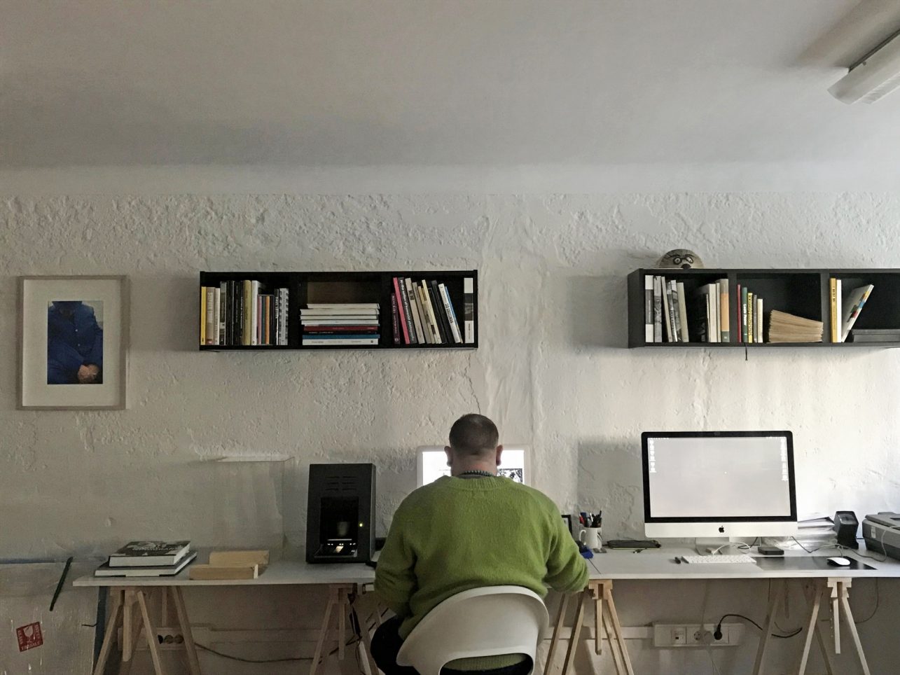
It’s great fun to print out test prints and experiment with the relationships between the photos and create new narratives. When working with photographs, it’s worth trying out editing tools. You don’t have to manipulate the photo heavily, but a few simple steps can deepen and sharpen images and adjust the chiaroscuro. Both traditional labs and some Photoshop tools have similar functions. We openly share this process in our studio – come, visit us!