Coats of arms existed before street names and the era of advertising billboards. Even today, a coat of arms continues to tell stories about history, values, and identity. We discuss the language of symbols and the process of creating it with one of Lithuania’s most renowned heraldic artists, an educator, and Vilnius Academy of Arts professor, Rolandas Rimkūnas.
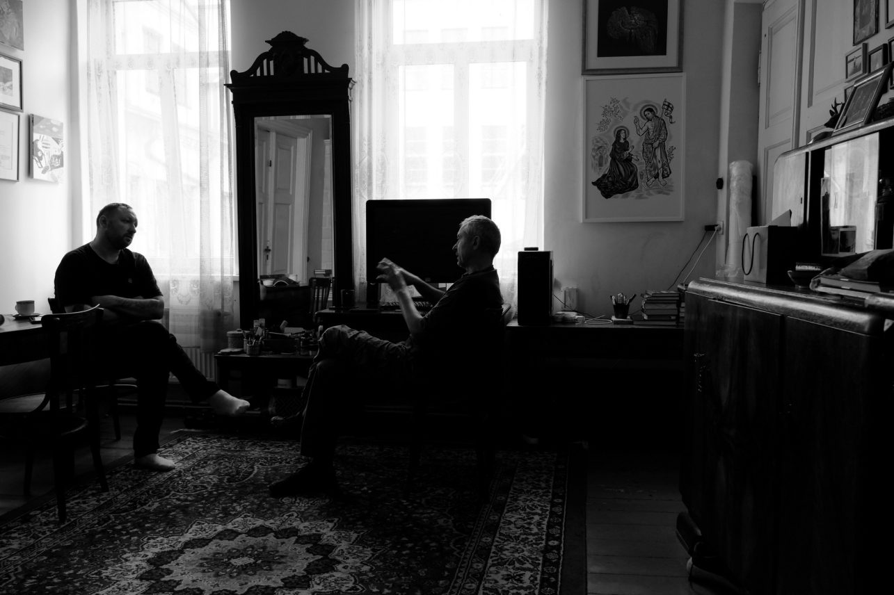
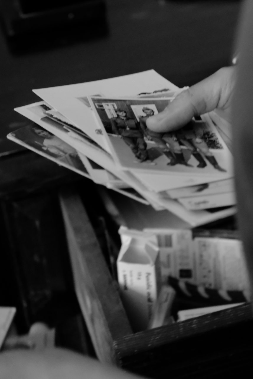
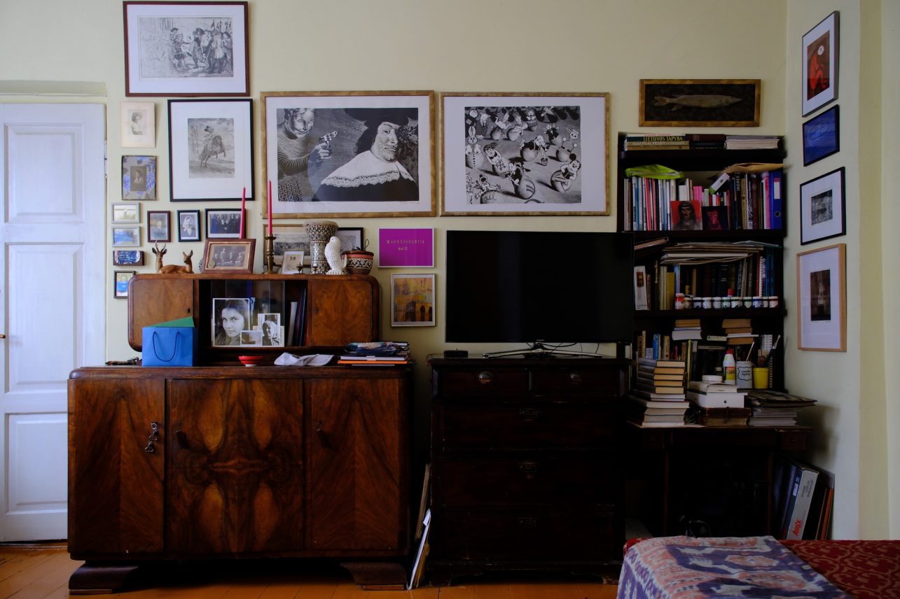
We meet in his family’s apartment on V. Putvinskio Street. Early autumn is shimmering outside, and the inside is full of signs of Kaunas’ history. Antique furniture, photo albums from the interwar period with faded images, and a conversation that stretches from his father’s exile to the challenges of the modern state’s identity.
(Text published in the magazine “Kaunas Full of Culture” 2025 October issue “Signs”)
Clear values
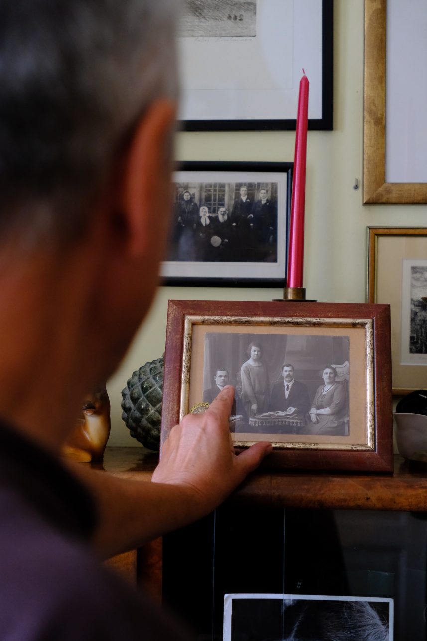
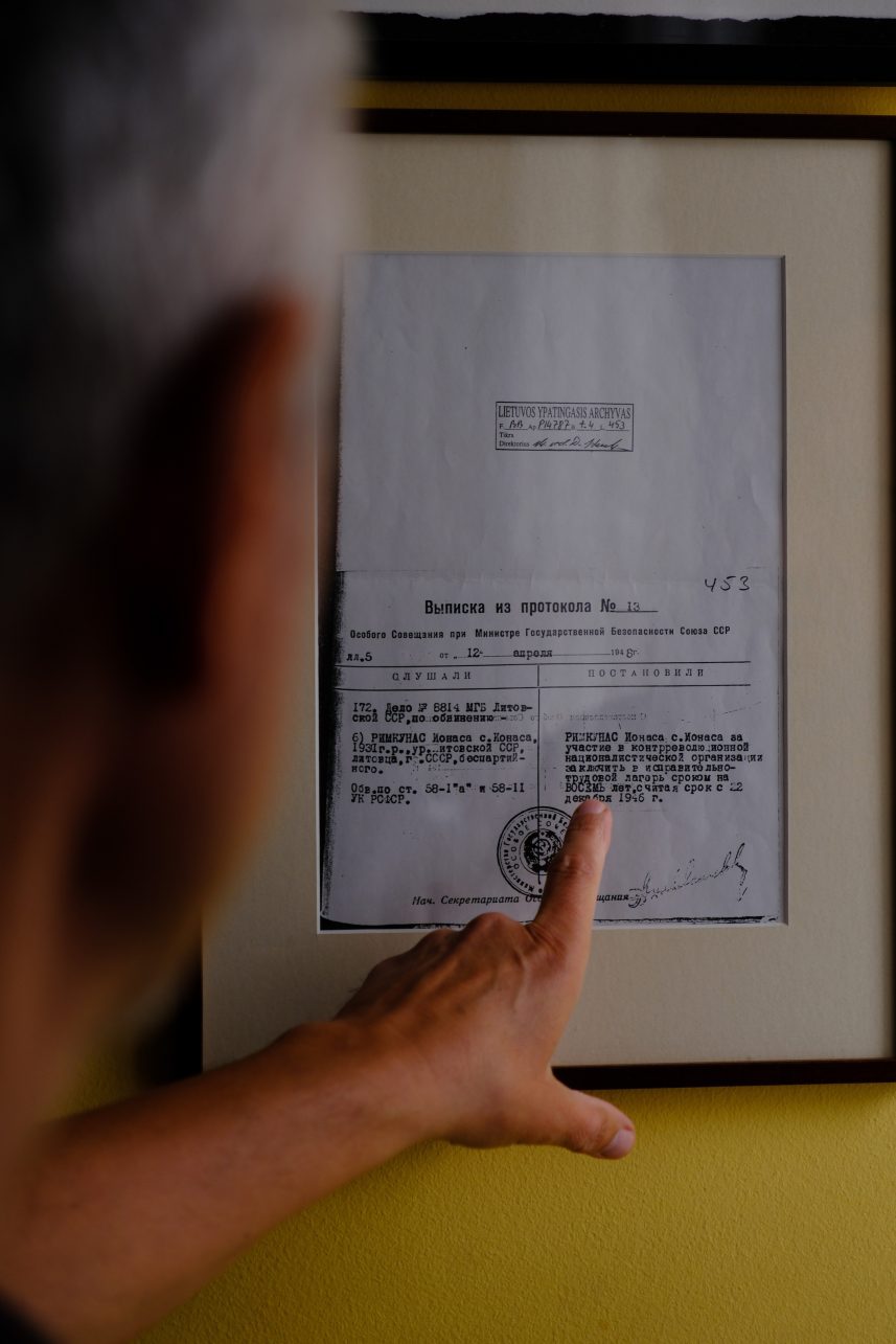
“My father returned from prison. He had served eight years,” the artist begins his story. The family regained the right to live in Lithuania only in 1963 – the year he was born – after receiving a reply from Moscow following many attempts to communicate through railway workers. Childhood in Soviet apartment blocks – in Petrašiūnai, the Draugystė district, and Dainava – and the persistent feeling that history was far more complicated than it was being presented, shaped a sharp sense of justice. This experience left a deep mark that continues to permeate R. Rimkūnas’s view of the past and its symbols to this day.
“When some lady or gentleman, whose parents worked in television during Soviet times, starts lecturing you as if you were some backward Soviet person, it feels strange,” he says. “Or when you see that those who collaborated now live better than those who fought, were exiled, or shot. Or when they rehabilitate Nėris. I can’t accept that. It’s like if someone raped your daughter and then brought you the rapist’s portrait, painted by a famous artist, and told you to admire it because it’s art. Maybe it is artistic – but I don’t need it.” This uncompromising approach to values will become Rolandas’ professional backbone as a heraldic artist.
The path to arts during the Soviet era was a kind of salvation: “There, you could be a freer person.” Yet even there, freedom was limited: entry into prestigious painting or graphic art programs was reserved for those “on the list,” as the system was strictly controlled. “If you hadn’t graduated from that Soviet institute and weren’t a member of the Artists’ Union, you couldn’t even buy paint. You could only enter the art supply store with an ID,” he recalls of the Soviet-era reality.
First – for Prienai
After serving in the Soviet army and working at the Centrolitas iron foundry, studying at the Vilnius Academy of Arts in the Glass art department – even if it wasn’t his first choice and even if he only managed to get in after the third try when there was no competition – seemed “close to perfection”.
He also liked painting, but life dictated its own conditions: he had to support his family. That’s how he turned to graphic art, a more practical field, which led to applied work: posters, flyers, illustrations. And eventually: heraldry.
“Professor Raimondas Miknevičius, who was then a member of the Heraldry Commission, invited me to create the coat of arms for Prienai. Well, one has to eat,” the artist smiles. And so in 1996, after eight months of work restoring the 18th-century symbol of St. George, began a journey that has lasted for three decades. The reason was simple, but it perfectly aligned with his calling and his love for history.
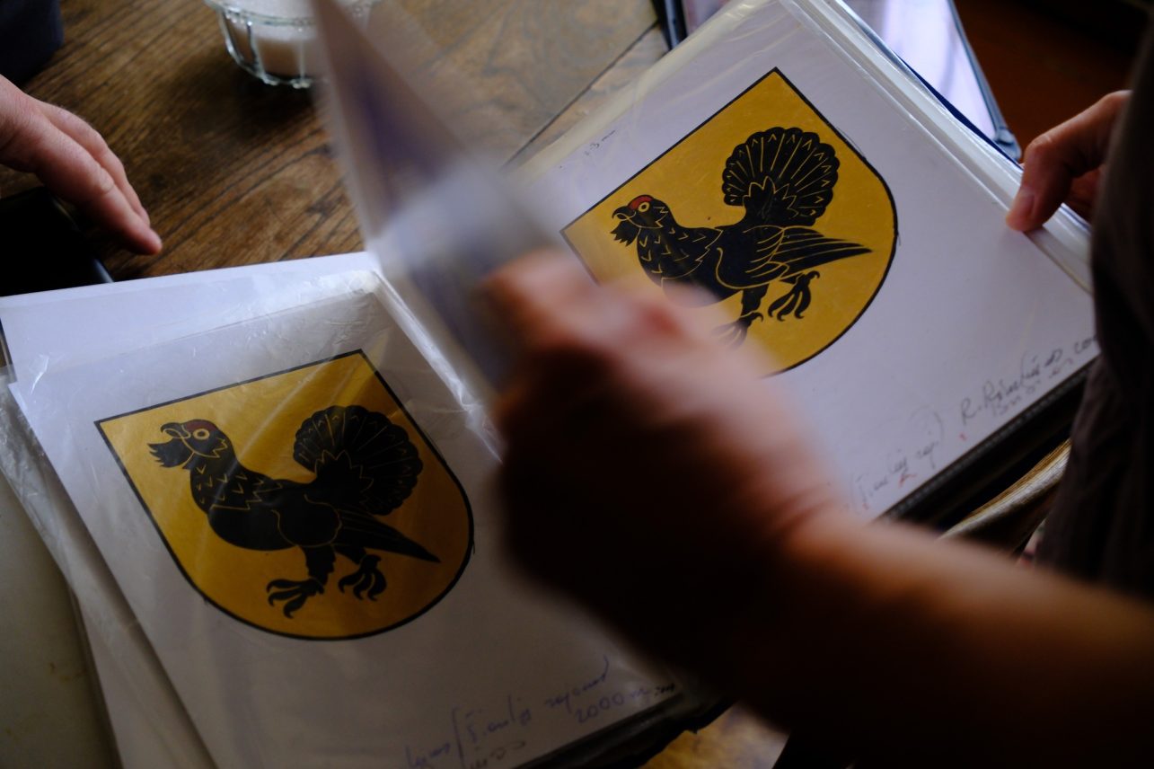
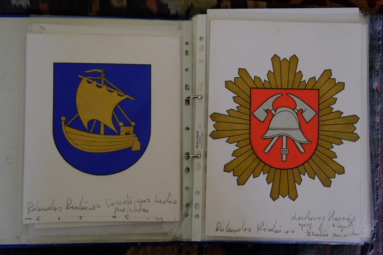
Many people imagine that a coat of arms is simply a beautiful picture. However, its creation is a strictly regulated, collective process that requires deep historical knowledge. “First of all, the community – a city, town, or eldership – must apply to the Heraldry Commission of the Republic of Lithuania under the President,” the artist explains. It is this commission, composed of historians and artists, that grants permission to begin the work. The commission oversees the entire process to ensure that historical accuracy, heraldic rules, and the broader context of national symbolism are maintained. What follows is a dialogue between the artist, community representatives, and historians. They search for ideas that would best reflect the uniqueness of the place – its historical events, geographical location, natural features, and legends.
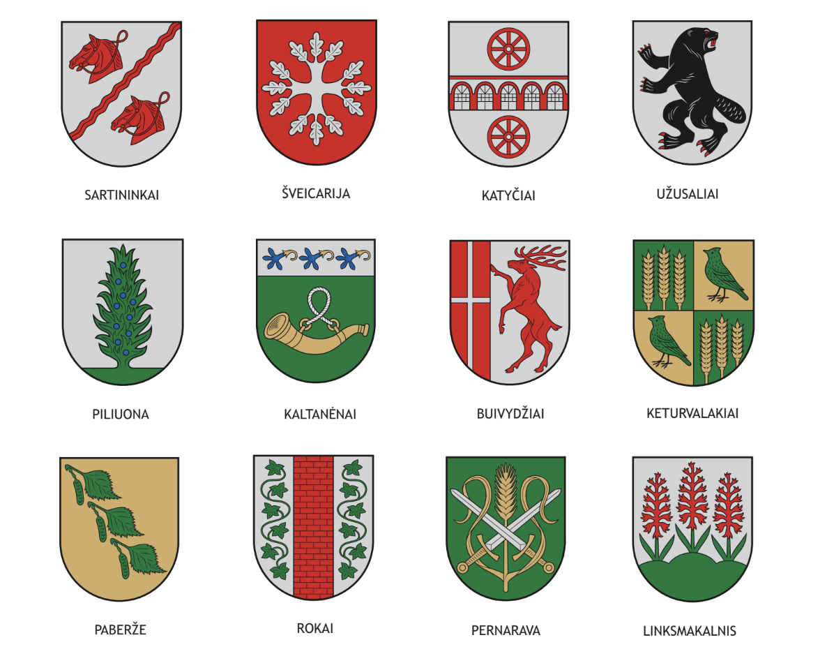
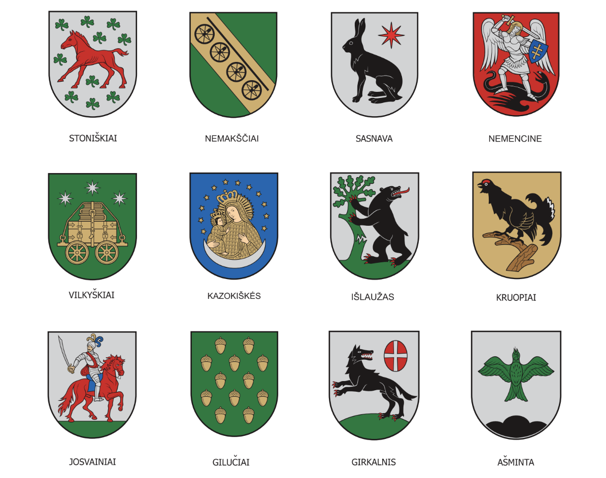
In the past, hand-drawn sketches had to be taken to Vilnius, but now the process has moved into the digital space. Sometimes dozens of versions must be prepared before a final decision is reached – one that satisfies all sides, though it may not necessarily seem the best to the artist himself. Occasionally, mythical creatures are born, as in the coat of arms of Viešvilė – a half-horse, half-fish figure symbolizing the connection between land and water routes. The most important thing is that the symbol is clear and meaningful to the community itself.
A coat of arms is either restored or created. Restoration, as in the cases of Prienai or Stakliškės, requires meticulous work with historical sources. However, most Lithuanian localities never had historical coats of arms, so they had to be designed anew. This opens space for interpretation, but it still rests on clear principles. Pagan and Christian motifs coexist in the symbolism, but they are understood primarily as part of cultural heritage. “For example, the church of Zapyškis in the town’s coat of arms doesn’t mean “be Catholic.” It sends a message that we respect history, heritage, and the creative power of the people who built this architectural masterpiece.”
Inspiration from late Gothic period
The basis of the coat of arms – the shield – is not just an aesthetic form. “A shield is an object of defense, so within it are the values we choose to protect. And would you die for those values, if necessary? If not, then your values are only financial,” the artist draws a sharp line. In modern Lithuanian heraldry, the form of the late Gothic shield is used uniformly. It was during this period that the symbolism of the Lithuanian state began to take shape. This value principle is the fundamental difference between a coat of arms and a commercial logo.
“Heraldry has evolved into graphic design; cities now have so-called brands. But, for example, the taurus in Kaunas’ coat of arms is frowning, fierce, and defensive. Why would a business want that? They want something smiling. And that’s the fundamental dividing line,” says R. Rimkūnas.
Taurus – a symbol that has accompanied Kaunas since ancient times – was replaced by a bison during the Soviet era. When President Algirdas Brazauskas restored the historical taurus, some residents of Kaunas were upset – they felt that the “powerful bison” was being taken away and replaced with a “cow.” Yet the return of the taurus was an act of respect for tradition.
Don’t run from battle
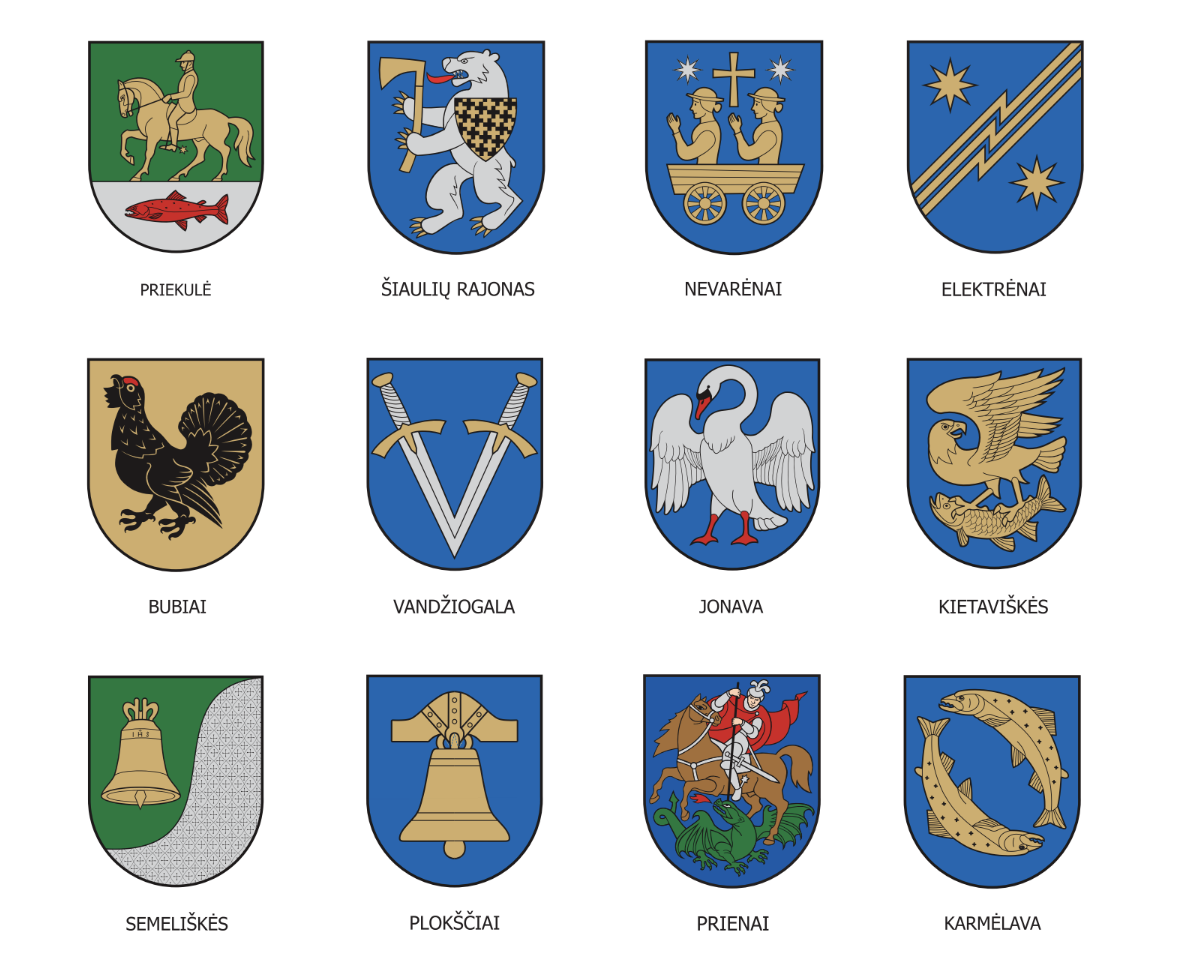
Even the direction of the figure is important. The heraldic right is the viewer’s left, the side closest to the enemy and closest to God. Therefore, the horseman on a shield always moves to the right. “The bearer of a coat of arms cannot run away from battle. If he did, the symbol was turned around, and that would be it: he’d lose his honor,” the artist explains. Such rules don’t allow for free “play,” but they create a unified, clear, and universally understood language of symbols.
There are also more complex cases, when several traditions or communities must be combined. “For example, there is the so-called Spanish division, when a coat of arms is divided into four fields. This was the case in the Polish-Lithuanian Commonwealth: the Polish eagle, the Lithuanian horseman, and the Ruthenian Saint Michael the Archangel. Sometimes a royal symbol also appears in the center, like Poniatowski or Stephen Báthory. In such cases, complexity is inevitable because you cannot simply remove one side’s symbol. Still, it remains a system in which every element has its meaning.”
State symbols – the horseman with the crosses of Jogaila, the pillars of Gediminas – are inviolable. Everything else can be interpreted, though within limits. Moreover, not every community can have a coat of arms. Cities, towns, and districts — yes. But the elderships or individual families cannot have coats of arms approved by the state. There is the Union of Nobles, which creates its own emblems, and there are community flags, such as in the case of Šančiai – but those are not considered official heraldry.
Another important rule concerns color combinations. In heraldry, the principle holds that color cannot touch color, and metal cannot touch metal. This means that red cannot be placed on blue, and gold cannot be placed on silver. There are exceptions, such as in the coat of arms of Jerusalem, but in Lithuania, we follow the classical system. Yellow represents gold, white represents silver, while red, blue, and black are considered colors. Because of these rules, coats of arms remain clear and high in contrast. “A symbol must be understandable to everyone. Originality has no value if no one understands you.”
What are our colors?
Although Lithuania’s heraldic system is established and functions well, the country’s overall visual identity, according to the artist, is in crisis. The root of the problem lies in the existence of two national flags: the tricolor and the historical flag.
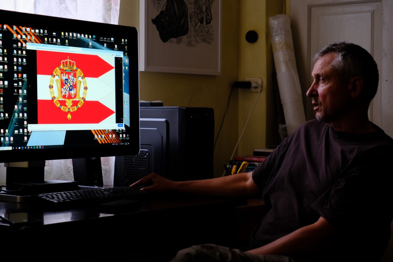
“The colors of the national coat of arms are red, white (silver), and yellow (gold). The tricolor flag has yellow, green, and red. Altogether, that gives us six colors. Everyone uses them however they like. But in marketing, if you want to be remembered, you should use as few elements as possible. And we have six,” R. Rimkūnas remarks critically. The artist shows examples on his computer screen. “Look at Poland: the national post office, the Orlen gas station network, the ministries – everywhere, two colors dominate consistently: biała-czerwona (white and red). This creates a unified, recognizable, and strong image. Meanwhile, in Lithuania we have chaos. Lietuvos paštas is yellow and black, like the one in Germany. Other institutions are green, blue, red.”
This visual distraction, he believes, is a symptom of a much deeper problem. “It partly reveals that we still don’t really understand our own identity. And if we don’t quite understand it ourselves, others understand it even less. And sometimes, if you don’t know, others are more than willing to help you understand,” he hints, referring to the geopolitical context.
Toward the end, the conversation turns to the future and to the idea of visual ecology. We are surrounded by so many images that they are losing their value. “If you can’t create something better than artificial intelligence, then maybe you shouldn’t be drawing at all?” R. Rimkūnas asks provocatively.
In an era of visual noise – when even restroom signs have turned into incomprehensible puzzles – heraldry remains an island of stability and clarity. It reminds us that a symbol only has power when everyone understands it.
The main symbols have already been created; nearly every city and town now has its own emblem. But that doesn’t mean heraldry specialists will run out of work. “Every symbol can be reinterpreted, adapted, or stylized anew. But the essence – the values we agree to protect – remains unchanged,” the interviewee concludes.